Make a Noticeboard Notice Easy to Scan
Make a noticeboard notice easier to scan, so passers-by can spot the purpose, essential details and next action without deciphering a crowded page.
A noticeboard notice should tell a passer-by what matters before they stop to read it. For a noticeboard notice, the clearest visual layout puts the purpose first, the decision-making details next and one visible action last. A logo, photograph or decorative border cannot do that work on its own.
People approach a board with different amounts of time. Someone waiting in a library foyer may read the whole page; someone passing a community centre may glance at its largest words. Design for both: make the main point easy to catch, then arrange the supporting details in a calm, readable order.
Make the main point the largest element
Lead with the event, service or request in ordinary language. “Bring a mug to the repair café” tells readers more than “Community initiative”. “High Street access changes” makes a disruption easier to recognise than a general label such as “Important update”.
Use one short, prominent heading. A sheet of A4 paper, a dark felt-tip pen and a plain typeface can be enough; the heading should not compete with several slogans or a large decorative image. Add a smaller line if readers need to know whom the notice affects, such as “For residents near Willow Lane”.
Name the place directly when a shared space is affected. A photograph of a park may be attractive, but it does not tell someone which entrance is closed or where an alternative route begins.
Arrange the page around the reader’s decision
Choose the order that answers the main question a reader needs to settle:
- Event first: State what is happening, then give the date, place and way to take part. This suits a residents’ meeting, garden open afternoon or repair session.
- Change first: State what is different, then identify the affected place and period. This suits a temporary path diversion or a change to collection arrangements.
- Request first: Say what response or help is needed, then name who is asking and how to reply. This suits a call for tools or an invitation to report a damaged sign.
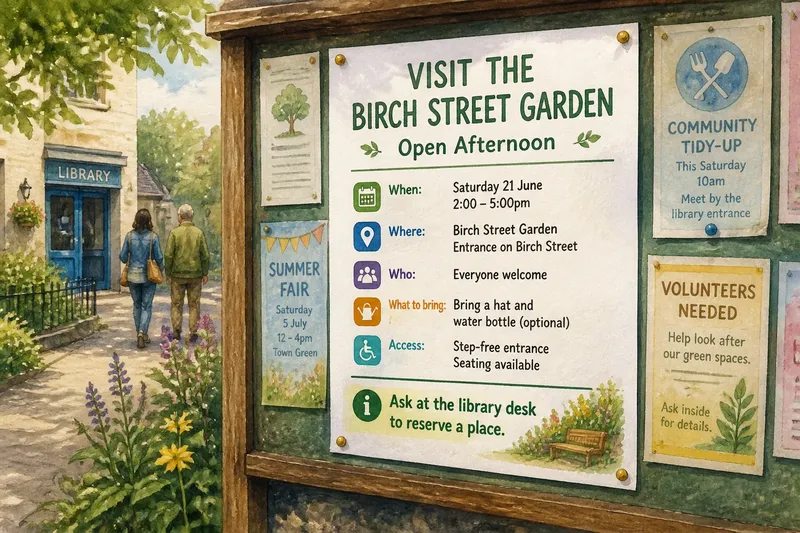
Say you are laying out a notice for an open afternoon at a shared garden, with the date, entrance and contact route already confirmed. Put “Visit the Birch Street garden” at the top, the date and entrance immediately below, and “Ask at the library desk to reserve a place” as the final, distinct line. A passer-by can then recognise the event, check where to go and see the next action without searching a block of text.
Separate details instead of burying them
Give essential information its own line or a short label. Include what helps someone decide whether to attend, understand a change or respond to a request; leave background material out if it pushes those details down the page.
- When: Check that the day and date are clear; if either is missing, add it before posting, or remove the time-sensitive claim until it is confirmed.
- Where: Check for a recognisable entrance, room or street corner; if the location is vague, name a landmark, or state that the venue is still to be confirmed.
- Who: Check whether participation is open or limited to a particular group; if that is unclear, say who the notice is for, or avoid implying that everyone is eligible.
- What to bring: Check whether an item is genuinely needed; if it is, name it plainly, and if it is optional, mark it as optional rather than making it sound required.
- Access: Check whether relevant information about steps, seating or an alternative route is available; if confirmed, include it, and if not, give a contact route for enquiries instead of guessing.
- Contact: Check that the named route works and is readable; if an email or desk contact is available, print it clearly, and if not, replace a vague “contact us” with a confirmed alternative.
Keep committee history, secondary activities and slogans from crowding out the practical information. A short line naming the organiser can establish responsibility; longer background belongs elsewhere if it obscures the reader’s decision.
Give one action a clear visual destination
“Get involved” sounds inviting but leaves a stranger guessing. “Join the Saturday litter-pick; meet beside the library entrance” gives both a next move and a place. Put the action on its own line, and make sure its route is actually usable.
A QR code can lead to fuller details or a booking page, but it should support the printed message rather than replace it. State what it opens and provide a readable alternative, such as an email address or a staffed desk, for readers who cannot use the code.
For a safety concern, direct readers to the appropriate local service. Do not invite people to handle a hazard themselves.
What should a noticeboard notice answer?
Should the date come before the event name?
Put the event name first when the activity is the main reason to stop, then place its date and venue directly beneath it. Lead with the date only when a time-sensitive change is the central message, such as a meeting moved from its usual day.
How much text should the notice include?
Include enough for readers to understand the purpose, judge whether it concerns them and take the next action. Move background and secondary details elsewhere if they compete with those essentials.
Is a QR code enough?
No: print the main message and state what the code opens. Add a non-digital contact route when readers may not have a suitable phone or data connection.
How can you check the reading order?
Ask someone unfamiliar with the notice to glance at it and say what it concerns, which detail matters and what they would do next. If they hesitate or give different interpretations, move the confusing detail higher or simplify the action.
Keep the whole board readable
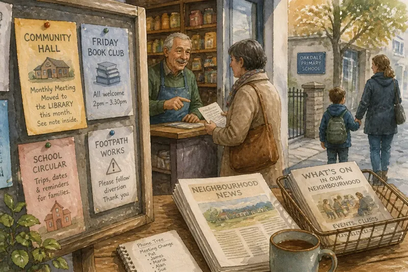
A clear sheet can still disappear among overlapping flyers. Leave space around its heading and make sure other notices do not cover a date, location or contact route. Ask the library or community centre who maintains the board if useful information keeps getting obscured.
Check the notice from the distance at which people approach. Use strong contrast, generous spacing and lettering that does not rely on colour alone. If a map is needed, keep it simple and name the destination in words as well as showing it.
Before posting, use the noticeboard notice test: cover the small print, read the largest words, then look for the essential details and the action. If any of those are missing or hard to distinguish, revise the page before pinning it up. The best layout makes the next sensible move visible even to someone who does not know the organisers or local shorthand.